Why a Logo Without a Visual Identity Doesn't Work
- iProgressio Writer
- Jul 28
- 4 min read
Ever noticed how some brands just stick with you, while others seem to fade into the background?
You can probably picture the Apple logo in your head, but that's not all. You also think of their sleek, minimalist product design, the clean lines of their stores, and the simple, elegant fonts on their website.
This is the power of a complete brand, and it highlights a common mistake many businesses make: they focus all their attention on creating a fantastic logo but stop there.
While a great logo is an essential part of your brand, it's not the whole story. A logo on its own is like a key without a car—it’s a powerful object, but it can’t take you anywhere by itself.
So, why isn’t a logo enough? And what’s the difference between a logo and a visual identity? Let's break it down.

The Logo: Your Brand’s Face
Think of your logo as your brand's face. It’s the single most recognisable visual element, the first impression you make, and the symbol that people most commonly associate with your company. A well-designed logo is a powerful asset—it can instantly convey professionalism, trustworthiness, or creativity.
However, a logo has its limits. It’s a static image that can’t tell your brand’s full story, communicate its values, or set the overall tone and mood. It’s a powerful starting point, but it's not the entire journey. As one article puts it, a logo is the "front door" of your brand, but it's not the entire house.
The Visual Identity: The Heartbeat of Your Brand
If the logo is the face, then your visual identity is the personality, the style, and the mannerisms that make your brand unique. A visual identity is the complete visual language of your brand. It’s the "shell" that holds your company's core values, beliefs, and message.
This comprehensive approach includes a number of key elements that go far beyond a simple logo:
Colour Palette: Colours evoke emotions and set a mood. A consistent palette helps create a recognisable and unified look across all your materials.
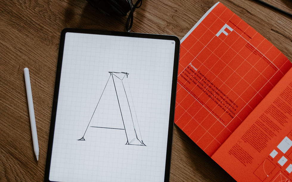
Typography: The fonts you use have a tone of voice. Are you serious and authoritative, or fun and playful? Consistent typography ensures your brand’s message is read with the right tone.
Imagery & Graphics: This includes the style of your photography, illustrations, and icons. These elements tell your brand's story and create a visual world that your audience can connect with.
Layout and Design: How all these elements are arranged on your website, social media, and marketing materials ensures a cohesive and professional appearance.
Together, these elements create a sense of place for your brand—a space that feels familiar and consistent, no matter where your audience encounters it.

Why the Combination is So Powerful
So, why does a logo without a visual identity fall short?
Ultimately, a brand is what people think and feel about your company. It’s the reputation you build in the minds of your audience. While you can’t fully control this, you can actively shape it with a consistent visual identity.
Without a strong visual identity, your brand’s message can become diluted and confusing. Your social media posts might look different from your website, which in turn looks different from your business card. This inconsistency erodes trust and makes it harder for people to remember you.
A comprehensive visual identity, on the other hand, creates a deeper, more consistent experience for your customers. It builds trust, fosters loyalty, and makes your brand feel cohesive, professional, and reliable. It’s what transforms a simple logo into a memorable and lasting presence in the market.
So, How Do You Build a Strong Visual Identity?
So, if a logo is just the beginning, how do you start building that cohesive visual identity? It’s not about guesswork; it’s a strategic process. Here are a few key steps to get you started:
Start with Your Brand's Core: Before you choose a single colour or font, you must define your brand's foundation. What is your mission? What are your core values? Who is your target audience, and what do you want them to feel when they interact with your brand? Your visual identity must be a direct reflection of these core truths.
Consciously Define Your Visual Elements: This is where you bring your brand's personality to life. You'll need to make deliberate choices for your colour palette (the main colours that represent you), your typography (the fonts that set your brand's tone), and the style of your imagery (whether you use clean, minimalist photography or vibrant, custom illustrations).
Document Everything in a Style Guide: This is perhaps the most important step for maintaining consistency. A style guide (or brand guide) is a simple document that outlines all of your visual rules. It acts as a reference for anyone creating content for your brand, ensuring your logo is always used correctly and your fonts and colours are consistent across every single platform.
Apply It Consistently, Everywhere: Your visual identity should be present in every single customer touchpoint. From your website and social media profiles to your email signatures and business cards, every element should feel like it belongs to the same family. This relentless consistency is what builds trust and makes your brand feel professional and established.
A logo can be a great piece of art, but without a complete visual identity, it can't build a great business. By taking a thoughtful, strategic approach to your brand's entire visual language, you can create a memorable presence that connects with your audience and stands the test of time.